
The Blanding Pandemic
Remember when brands had personality? When McDonald's was a riot of primary colours, and luxury logos looked like they'd been hand-carved by artisans who actually cared? Well, those days are long gone. Welcome to the age of blanding. A time where everyone is opting for the same sleek, safe, sans-serif sameness. But when everyone looks identical, no one stands out. And in a world where distinctiveness drives recall, that's a branding crisis. The good news? The pendulum is swinging back. Heritage fonts are making a comeback, maximalism is creeping into our feeds, and brands like Burberry are finally remembering who they used to be.

Do you remember the McDonald's restaurants of the 90’s?
They were full of bright, bold, circus-like colours that smacked you in the senses more than the assaulting scent of greasy, deep-fried goodness wafting out of the air vents (we wrote an article on that too).
These days, however, McDonald's looks like it’s cosplaying as a dentist’s office - rendered browns and greys adorn the once-vibrant walls, with the iconic golden arches as the only reminder of that distant neon past.
But when you really stop and think about all of the brands, colour palettes, and typography that are around us these days, there’s a sort of dawning horror…
Why does everything look so… boring?
Well, it’s all down to a design phenomenon nicknamed ‘blanding’. And once you notice it, you can’t unsee it. (Or, to put it more accurately, your eyes won’t see it as they’ve already lost interest in that plain Jane logo and have moved on to the next.)
Blanding is running rampant through the marketing world as its own form of a pandemic, and when your logo can’t stand closer than 1.5m to another without looking suspiciously the same?
Yeah. We’ve got a problem here.
HOW DID WE ALL END UP LOOKING THE SAME?
Let’s wind back the clock to the mid-2010s. At that time, the internet was quickly becoming not just a household staple, but thanks to Steve Jobs, it was also something that could be carted around with you, tucked right into your pocket. Brands weren’t just splashed on billboards and glossy magazines anymore - they had to squeeze themselves into tiny app icons, responsive websites, and social media profile pics.
Suddenly, centuries-old logos needed to be legible at the size of a postage stamp.
Out went the decorative, curly, character-filled fonts.
In came the no-nonsense sans serifs. Clean. Modern. Uniform.
There were good reasons for it. Minimalism was the mood of the decade (we have Steve Jobs and his wardrobe of black turtle-necks to thank for that, too). Flat design was everywhere (remember when every app icon went from fun 3D emojis to flat colours overnight?).
Luxury brands didn’t want to look old-fashioned; they wanted to look modern, contemporary, digital-friendly, and globally accessible.
And here’s where the psychology kicks in: humans love things that are easy to process.
There’s even a name for it: cognitive fluency.
In plain English, it means our brains prefer things that feel simple, familiar, and effortless to understand.
Research has shown we even rate statements as ‘more true’ when they’re written in easy-to-read fonts compared to harder ones. It’s all because the smoother the processing, the more positive we feel about the thing itself.
A sans-serif logo is smooth and simple. Your brain barely even breaks a sweat to read it. That ease feels trustworthy, sophisticated, safe. It’s the visual equivalent of ordering a flat white: straightforward, no frills, no fuss.
So when Burberry stripped its logo down in 2018, taking it from ornate to ordinary, it wasn’t just rebranding. It was signalling: we’re in the future now, keep up.
Others followed suit. Pretty soon, fashion week’s front row of logos became the Kardashians of branding - different brands, but all looking weirdly the same.
BUT IS BLAND REALLY THAT BAD?
You might be thinking: the people don’t want bland, give fun maximalism back to the people!
(Doesn’t really roll off the tongue as a protest catchphrase, does it?)
But the reality is - we’ve embraced it. Brands are responding to the calls for minimalism, and we’re ending up in a sea of plain, indiscernible black puffer jackets, ‘sad beige’ aesthetic toys and playrooms, and sleek, silver, aerospace-engineered laptops that we just use to play The Sims.
So if we all like it, does it really matter?
Well, it does, and it doesn’t.
It doesn’t matter if you don’t care about creating a recognisable brand that cultivates continued loyalty.
It does matter if you do care about it. Simple!
The issue with everyone streamlining into the same visual identity is, well, everyone ends up with the same visual identity.
Let’s use an example of those you’d never expect would commit such a branding faux pas, but are some of the worst offenders.
The luxury fashion houses, once dripping in intricate flourishes, crests, and fonts that screamed heritage, have all started to look like they got dressed in the same outfit.
Balenciaga. Saint Laurent. Our friend Burberry.
Suddenly, everyone’s typography looks like it was picked from the same Canva template: clean sans serif, bold weight, all caps.
We’ve shackled them up and herded them into a lineup:
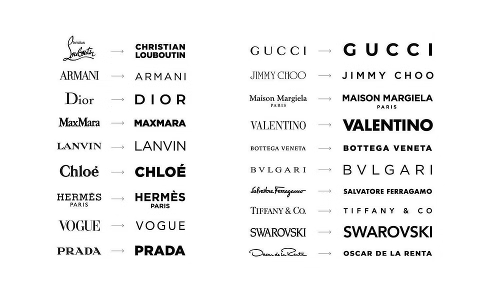
Can you instantly tell them all apart? Maybe if you squint. Maybe not. And if you can’t, that’s a branding problem. Distinctiveness is one of the strongest predictors of recall.
Marketing researchers (shoutout to Byron Sharp and Ehrenberg-Bass) have hammered this point home for years: if you want people to remember you, you have to look different enough to stand out in the blur of daily life. And it’s not necessarily about ‘better’ branding, or even ‘cooler’ branding, it’s about that uniqueness that drives mental availability.
When someone walks into a store or scrolls through Instagram, your brand has maybe half a second to trigger recognition. If your logo or colours, or typography look just like everyone else’s, your brain files it under ‘generic’ and moves on. But if you’ve got cues that are consistently and uniquely yours (like Tiffany’s blue box or Coca-Cola’s ribbon script) the brain latches on to these features.
Basically, distinctiveness makes brains perk up, sameness makes brains glaze over.
And when everything looks the same, the consumer experience goes flat, just like the logo itself. Instead of sparking recognition, luxury branding becomes the equivalent of Netflix scrolling fatigue. Hundreds of logos, endless choices, nothing that feels truly different.
What started as a chic design revolution has now become a sameness pandemic. The logos that once screamed luxury now whisper uniformity. The very move that was meant to make brands future-proof (simplification, minimalism, sans serif) ended up making them less memorable.
THE CIRCLE OF LIFE BRANDING
The first person to announce the change of an ornately designed logo to the sleek sans-serif version? Bold. Groundbreaking. Visionary.
The second person? Pretty fresh idea. Proven to work. Likely to get a few thumbs up in a meeting.
The 78th person? That impact wouldn’t even be measured as a whisper on the marketing Richter scale.
So how do you become the new Steve Jobs, striding across the stage, announcing your standout brand to the world?
You chuck a pink turtleneck on.
Culture craves balance, and when one aesthetic dominates too long, the opposite starts to feel refreshing.
That’s exactly what’s happening now.
Earlier this year, Burberry quietly ditched its stark sans serif and reintroduced a heritage-inspired serif logo. Not the exact one it had before, but something closer to its original DNA. It felt bold, not because it was new, but because it dared to zig while everyone else was still zagging.

This shift isn’t simply around fonts. It’s part of a bigger cultural trend. Interiors are moving from beige minimalism to ‘clutter-core’ maximalism. Fashion is embracing dopamine dressing, with bold colours and chaotic patterns. Pop culture has resurrected loud ’80s aesthetics we thought were dead and buried.
The psychology here? Novelty bias.
Our brains are wired to notice what breaks the pattern because, for most of human history, novelty signalled something important: food, threat, opportunity.
If everything in your environment looked the same and suddenly one thing looked different, you paid attention like your survival depended on it (spoiler alert: it did).
Your wiring hasn’t changed. Distinctive assets don’t just look interesting; they hijack your brain’s pattern-seeking software and then lodge themselves in your memory.
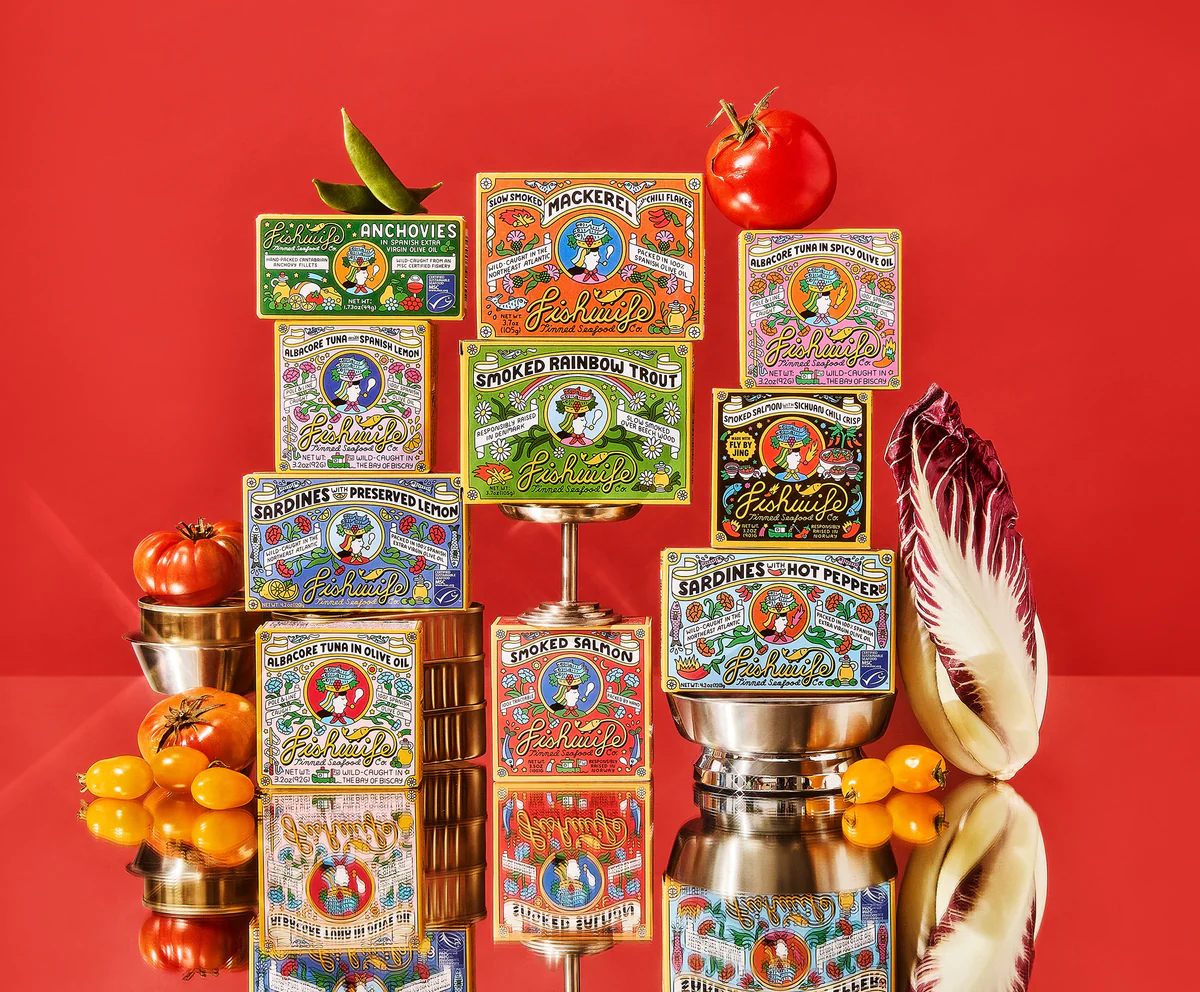
Take Fishwife - an artisanal tinned fish brand. Sure, it’s not the most glamorous of product spaces, but they’ve taken something you throw into the pantry without a second thought, and turned it into something you’d place in pride of place on the counter, propped up against the Maldon salt flakes and a brass pepper grinder for a bit of style. Their quirky, cluttered, Jacqueline-Wilson-book-cover-inspired branding not only catches your eye but radiates an effortless cool that comes with being proud to be loud.
After a decade of flat sans serifs, seeing a logo with personality again feels like watching Dorothy arrive in the wonderful world of Oz.
We’re in for a branding renaissance, people!
IS BLANDING OVER, THEN?
Not entirely. Minimalism isn’t going away forever. It’s still a strong look, and it works beautifully in certain contexts. But it’s no longer the automatic signifier of modern luxury it once was. Now, it risks looking like a safety blanket.
The lesson isn’t that you should ditch your sans serif and run back to serifs tomorrow. It’s that branding trends are cyclical. What feels fresh now will feel tired later. The trick is knowing when to lean into the trend and when to step out of line.
Psychologically, it comes down to two competing forces:
Distinctiveness grabs attention. Humans are drawn to things that look different. That’s how we notice newness, and it’s why heritage fonts suddenly look exciting again.
Familiarity builds trust. At the same time, our brains like what feels recognisable. Go too far into novelty, and you risk confusing or alienating people.
Burberry’s move back to a heritage font is strategy blended with nostalgia. It’s a reminder that the pendulum always swings back, and the brands that stay ahead are the ones that dare to be distinctive when everyone else is blending in.
So remember: no one has ever sat down to a bland meal and said ‘yum!’ (unless it was when nan served corned beef for family tea and we didn’t want to hurt her feelings).
Add some flavour to your branding: spice up the typography, bake in a sweet’n’sour personality, and season it to all your customers’ tastes.
For small business owners:
Conduct a ‘distinctiveness’ audit:
Pull up your logo next to five of your closest competitors. Be brutally honest: could someone outside your business instantly tell the difference? Or have you fallen into the trap of using the latest Canva font trend that every other brand is also using?
If it’s close-ish, but still different, you don’t necessarily need a total rebrand, but you might need to introduce quirks, colour, or typography that feel unmistakably you. But if you’ve got 8 brand doppelgängers out there? It’s time for a drastic change.Inject some personality:
Maybe you love your clean, minimalist logo. We see you: clutching it to your chest, afraid to let it go (are you a Millennial, by chance?).. And that’s fine - but remember, a font does not a brand personality make.
Your brand needs to tell a story and connect with your customer through the personality woven into every element. It’s in your tone of voice, your photography, your packaging, even the copy on your checkout page. Look for places where you can zig while others zag, like a witty web error message to turn frustration into a laugh, or a quirky tagline on your packaging for an unboxing experience that’s just as enjoyable as the product itself.Don’t fall into the trending-trap:
Trends will always change. Serif is ‘in’ today, colour was ‘out’ yesterday, and somewhere, someone else is one shower thought away from posting the trend that will take over them all.
Instead of chasing, anchor yourself in what’s timeless for your brand. What visual or verbal cues will always make sense, no matter what decade you’re in? Just like the ¾ denim jeans and brown suede baker boy cap I once paired together, some trends should stay dead.
Need help turning psychology into sales? Here's how Milkshake can help when you're ready:
🎨 Squarespace Website Design — Get a stunning, conversion-focused Squarespace site that reflects your brand's personality and makes visitors want to stick around. From layout to flow, we'll design a site that feels as good as it looks. Learn more →
🧠 DIY but kinda lost? Grab our free resource: "The Ultimate Guide to Brand Psychology" and learn how to apply these principles yourself. It's packed with science-backed principles, real-world examples, and actionable tips ready to use. Get your slice →
✨ Rebranding — Ready to shed the bland and stand out? We'll help you reimagine your brand identity with strategy, personality, and visual distinctiveness that actually gets noticed. View our work →
✏️ Conversion Copywriting — Product pages, landing pages, emails, and ads that are anything but bland. See our copywriting services →